I have enjoyed this unit immensely. We began in easy stages, and I found it straight forward to begin with. I soon found that I needed to refer to guidance notes as the technical aspect became more advanced. I do believe though that with more practice I will master all of the techniques and become proficient in all areas.
I particularly liked how easy it was to change colours in designs. This gave me a useful and quick tool to contrast colours in my design, making colour selections virtually effortless. It would be far more labour intensive if I had had to draw out the design several times over by hand to test colour contrasts.
I also liked the fabric rendering section, where images could be used from google to then wrap on my design. I liked the immediacy of the results, making it easy to trial many different designs in a short space of time.
I felt disappointed with the colour reproduction of some of the images in the blog. They were not a true representation of what I had used on Photoshop.
Initially I had difficulty setting both the offset and the anchor for the pattern repeat exercises. However I found with practice my skills improved and by the time I completed the mirror pattern section I had no difficulty with this.
In conclusion I have really enjoyed learning these new skills and I find the application both time saving and exciting. I look forward to using this again in future projects.
Tuesday, 1 April 2014
Mirror Repeat Pattern

Although this pattern does not represent Bauhaus (my art movement) in any way as Bauhaus is the use of geometric shapes, I really enjoyed making this pattern and am pleased with the outcome of it, I like the white and pink together. The reason this pattern does not show any relation to Bauhaus is because I needed to show a mirror repeat pattern and geometric shapes are symmetrical and therefore you wouldn't be able to see that it has been mirrored.
I found this pattern really easy to do, I firstly got my shape on a white 10cm x 10cm canvas (copy this image) and then went to canvas size and made the width 20cm but kept the height at 10cm, at this point I also set the anchor to the right and then pasted the image I then reversed this second scissor shape so they were facing back to back and placed this on the empty canvas side. Then define pattern, I then made a new document and set the measurements to 60cm witdth, lastly I filled the whole page with my pattern.
I definitely will be using this technique again as I think it gives a very effective look where as actually its extremely simple.
Wednesday, 26 March 2014
Half-Drop repeat pattern
 |
| original pattern design |
 |
| finished Half-Drop repeat pattern |
Saturday, 22 March 2014
Brick repeat pattern

I created a new pattern design only using photoshop, I did this by firstly setting my canvas size so the width and length were equal to make it a square, I then used the fill tool to set the background colour to this dark teal colour. After this I got a diamond shape from the 'custom shape' options and dragged it over the whole background, this turned out looking like a golf jumper pattern, so I then used the 'bucket fill' tool again to make the middle row of diamonds a light blue and the outside two rows a magenta colour. I absolutely love this colour scheme and will definitely be using these colours on my final fabric for the dyeing and printing.
I then used my design to make a brick repeat pattern, I achieved this following these steps:
I firstly selected the whole of my design (Ctrl-A) and then copied it (Ctrl-C).

I then changed the canvas size so there is an empty canvas directly underneath my design (width 0 and height 100) so the anchor looked like this (below)

Next I set the offset(only selecting one of the design squares) by going to filter then other and finally 'offset', i set my horizontal offset by eye but you can also do it by halving the pixel width.
Then like when I was making the block repeat pattern I defined the pattern (making sure I had already flattened the layers!) and finally created a new document and pattern filled the A3 international paper page with my pattern from the options.
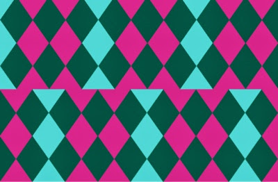
I found making this pattern a lot harder than the previous block repeat pattern and had some trouble when setting the offset, therefore I definitely need some more practice before I can do this without instructions.
Coloured Block repeat pattern

I also did a coloured version of the previous pattern I added the colour to my mark making by using the 'quick selection' and 'bucket fill' tools I chose a purple/ burgundy colour although it seems to have come out a bit brown here, and then repeated the same steps to make the block repeat pattern.
I do like the way it has injected a bit of colour to the pattern however I feel it would have been more effective if I had chosen a brighter colour like turquoise for example.
Saturday, 8 March 2014
B+W Block repeat pattern
 |
| Block Repeat Pattern |
Overall I feel I found this task quite simple to carry out and feel I could easily do it again on my own at a later date! Although this pattern is very 'Bauhaus' I don't feel it's really the pattern I would like on my garment, I would prefer the pattern to be less busy and more structured and also this pattern doesn't fit together very seamlessly wich also let's it down.
Friday, 7 March 2014
Kelly Smith

wide variety of both different techniques and
materials when creating her illustrations for
example pencil, watercolour and she also uses
photoshop to edit her images and add more colour
and also to adjust the colour levels. She builds her
images by firstly gathering several different pictures
that she wants to make up her illustration with,
in this case(below middle picture) she uses a photo
of a girl, skull, antlers, and also flowers, and draws
all of these aspects in one picture, she then adds
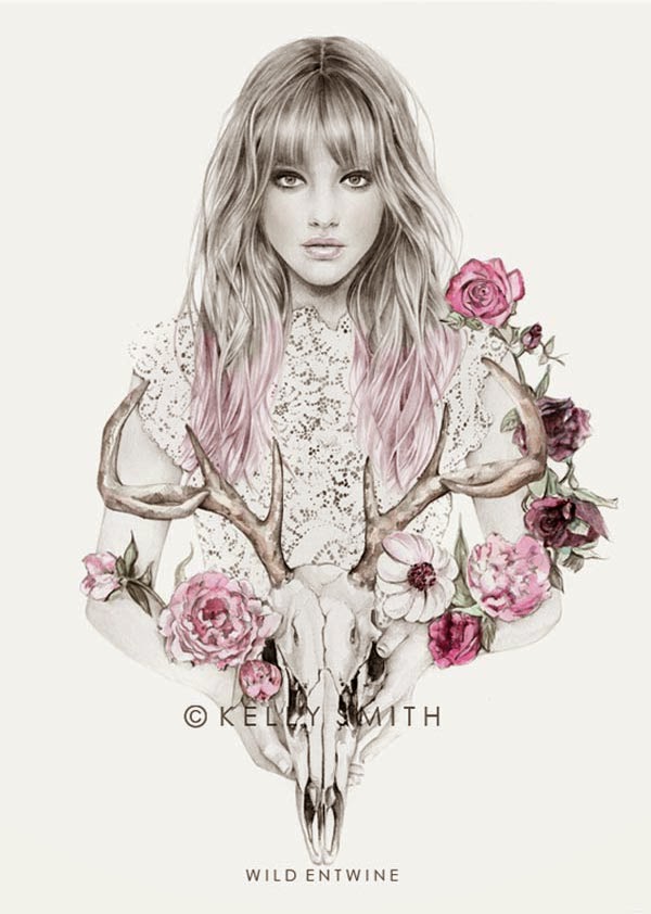
Colour by hand using watercolours and generally
sticking to earthy colours such as shades of pinks,
purples, reds and greens. Kelly then goes on to
edit her drawings in Adobe Photoshop adjusting
the colour to make it more vivid and also adding
very subtle colour to the face, in this case she has
edited the cheeks, lips, hair, and flowers and possibly
the skull as well. I love the way Kelly Smith only
adds colour to certain parts of her illustrations and
then leaves the rest in black and white, I think this
creates a very striking and interesting image I also
think the way she brings in things such as the
antlers, roses and I love the way she has made the
girls hair look like feathers, it creates a very natural
and innocent image but at the same time a bit dark
due to the use of the antlers and skulls. I would
definitely like to use her style of only highlighting
certain aspects of the image with colour in my own
illustrations, I also like the idea of not just
showing the garment but also making more of a
work of art by adding in items like the flowers.
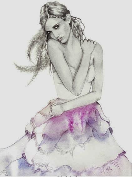
Nadia Flower


Nadia flower is very similar to Kelly Smith with her use of flowers, feathers, and animals in order to add a very natural, rural feel to her illustrations. she also uses a limited colour palette only using pastel colours to further emphasise the rural almost tribal look.
I really love her illustrations however I don't think my CAD skills are quite up to the standard where I could achieve an image like this .
I believe Nadia flower makes her illustrations by using CAD and by hand as well (pencils and watercolours), some of her work is more CAD based which I don't like as much I like the soft look in these images where both techniques are used.
Thursday, 6 March 2014
Mark making
 |
| Mark Making Sheet |
Wednesday, 5 March 2014
 |
| Design/Illustration Using CAD |
Again I really enjoyed using CAD (Photoshop) for this design and found it very easy to use.
Tuesday, 4 March 2014
 |
| Photoshop |
Using Photoshop along with a template I learnt how to fill in certain sections using the 'quick selection' tool and then filling it with my chosen colour. we then went on to get an image of a pattern we liked off Google which we I then used as the material for the skirt.
I found this method of creating CAD illustrations/ coloured designs quite simple and therefore also rather easy and so I will definitely go on to use this technique in the near future.
Sunday, 2 March 2014
 |
| Design + Illustration |
In order for my design to represent Bauhaus (given art movement) my dress will have 4 circular cut outs down the skirt on one side. My dress will also have a faux wrap bodice and have a geometric print all over apart from the under wrap to further reflect the Bauhaus style.
I used the scanner in order to get my black line design into the computer, I found it a little difficult at first to use however I soon got the hang of it and I now believe I could use the scanner again on my own with no trouble.
I used the scanner in order to get my black line design into the computer, I found it a little difficult at first to use however I soon got the hang of it and I now believe I could use the scanner again on my own with no trouble.
Saturday, 1 March 2014
Subscribe to:
Comments (Atom)